You’ve probably heard the term “mobile-friendly” for years. For a long time, that just meant your website didn’t break when someone opened it on an iPhone. But in 2026, the game has changed.
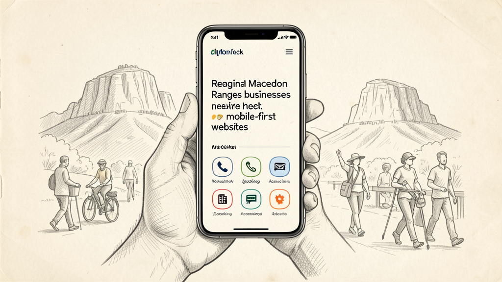
If you’re running a business in the Macedon Ranges or any regional hub, “mobile-friendly” is the bare minimum. To actually grow, you need a Mobile-First strategy.
Here is the difference, and why it matters for your bottom line.
The Difference: Mobile-Friendly vs. Mobile-First
Mobile-Friendly is reactive. It’s like building a massive, beautiful house for a desktop computer and then trying to shrink it down to fit on a phone screen. The result? Tiny buttons, hidden menus, and a clunky experience that feels like an afterthought.
Mobile-First is proactive. We design the experience for the smallest screen first—where most of your customers actually are—and then scale up for desktops. It means the most important actions (calling you, booking a service, finding your address) are front and center, not buried under a “hamburger” menu.
Why It’s Critical for Regional Businesses
1. The “On-the-Go” Customer
In regional areas, your customers aren’t sitting at desks; they’re in their cars, at the job site, or in the paddock. They need information now. If they can’t find your phone number or your hours in two taps, they’ll bounce back to Google and click on your competitor who made it easier.
2. Google’s “Mobile-First Indexing”
Google doesn’t look at your desktop site to decide where you rank in search results. It looks at the mobile version. If your mobile experience is slow or clunky, Google assumes your site is low-quality, and your ranking drops—even if your desktop site is a masterpiece.
3. The Trust Factor
A website that feels native to a phone feels professional. It tells the customer that you understand how they interact with the world. A dated, shrinking desktop site suggests a business that hasn’t updated its processes in a decade.
What a Mobile-First Site Actually Does for You:
- Faster Load Times: By prioritizing essential content, the site snaps open instantly, even on patchy regional 4G/5G.
- Thumb-Driven Navigation: Buttons are placed where thumbs naturally land, making it effortless to book or buy.
- Clearer Calls to Action: Your “Call Now” or “Get a Quote” button isn’t a tiny link; it’s a prominent, easy-to-hit target.
Bottom Line: Your Website Should Work as Hard as You Do
You wouldn’t show up to a job with the wrong tools for the task. Why give your customers a tool (your website) that doesn’t work for the device they’re holding?
A mobile-first website isn’t just a technical upgrade—it’s a business strategy. It ensures that no matter where your customer is in the Ranges, the path to your business is wide open.